March 27, 2020
Census Boundary Maps are lying to you
1492 words | 7-min read |
TL;DR
Visualising data on maps using artificial boundaries (constituencies/census boundary/county) would change how people perceive the map. The map could even deliver the message wrongly because of the disproportionality between colour area and population. When reading maps with artificial boundaries, be aware of the visualisation technique used.
Picking Up From Previous Map
Last time I made a map by categorising the main means of transport to work in Hong Kong. You could read the blog if you still haven’t done it yet. Things are going great until one of my friends asked:
Why data are also available in Ninepin Group (果洲群島)?
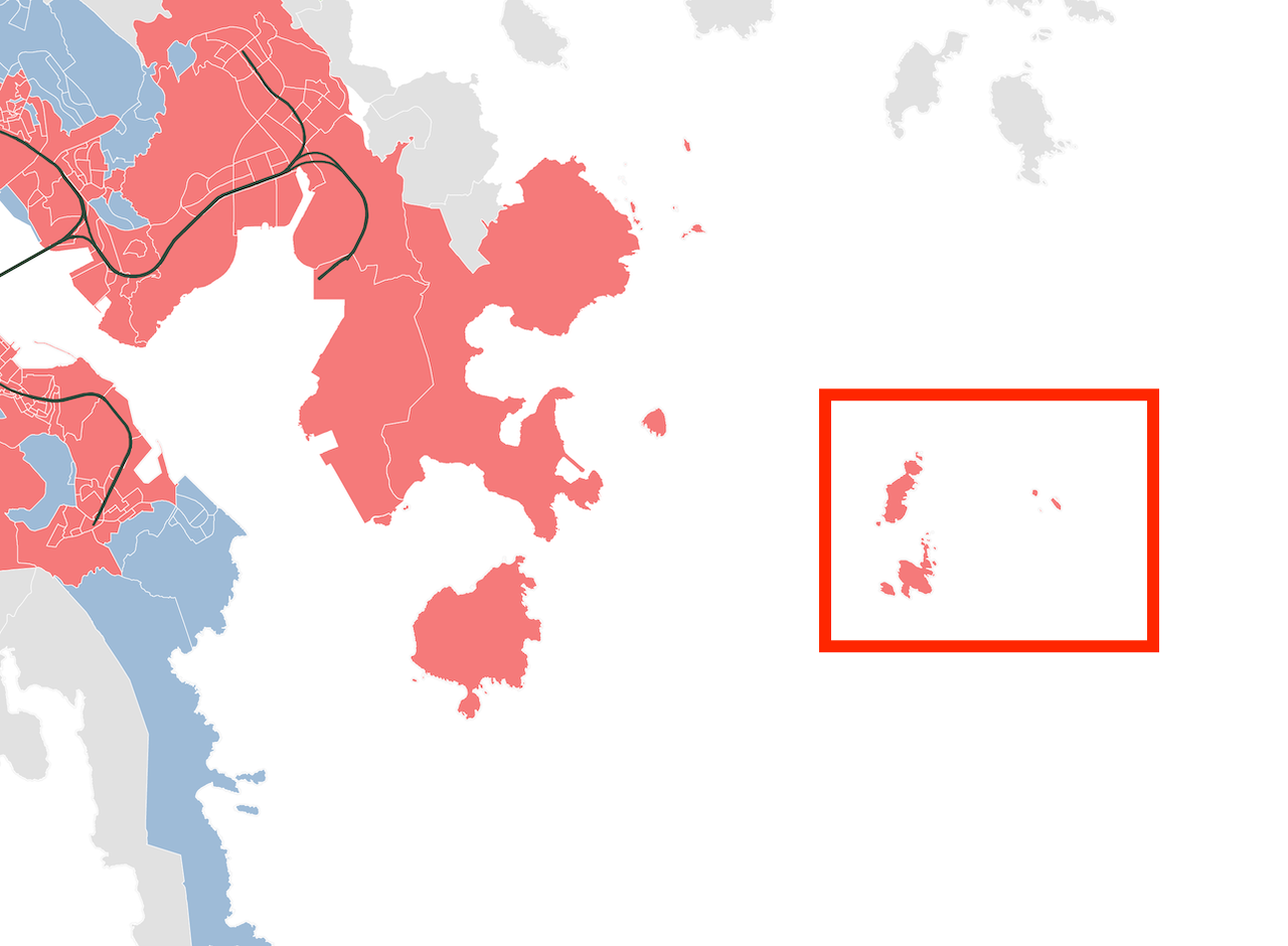
Ninepin Group is a group of 29 Islands located in the easternmost waters in Sai Kung District. With its isolated environment, no one lives in the Islands. There are even no regular ferry services — you have to rent a boat to land on the islands.
.jpg/1920px-Ninepin_Group_Aerial_(sharper_colors).jpg)
View of Ninepin Group (Source: Wikipedia)
The reason behind this strange colouring is because of the census boundaries . Ninepin Group is in the same street block (SB) with Clear Water Bay, a high-class residential area located to the West of Ninepin Group.
Why same census area?
I lied in my map — the census unit used is actually Large Street Block Group (LSBG), not SB. LSBG is a census unit created by merging several SBs. There are about 5,000 SBs in the territory, while there are only about 1,600 LSBGs. The map below shows the census boundary of both LSBG (dark grey) and SB (light grey). Most large LSBGs in the countryside are comprised of many SBs.
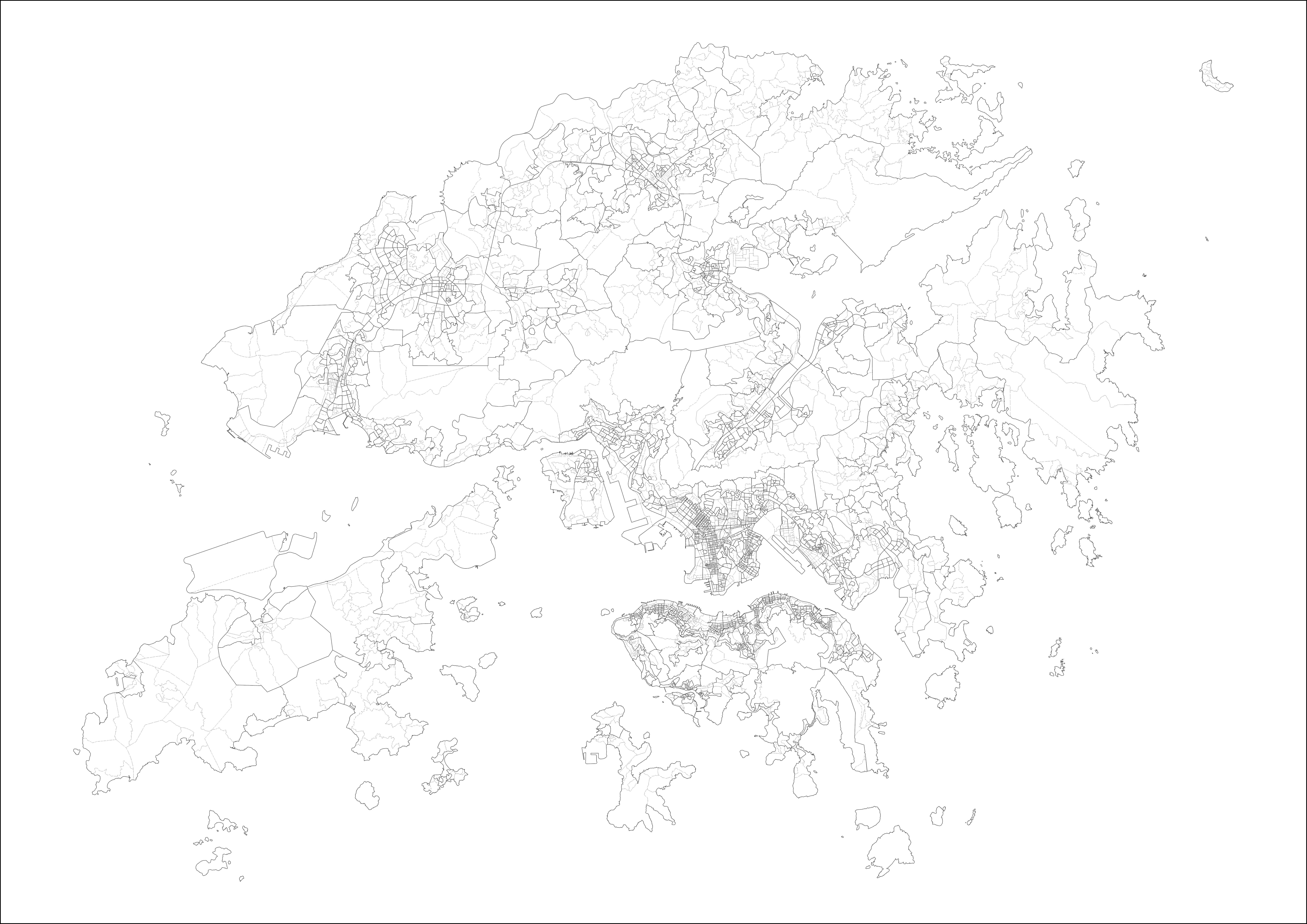
At its first glance, combing a street block of islands and a low-density domestic area seems meaningless. (Technically speaking, Ninepin Group is classified as Village Boundary (VB), yet the term “street block” is used to refer to this census boundary level.). Of course, people in the government won’t do tasks without reasons. LSBG are merged from various street blocks to ensure the whole census boundary has at least 1,000 residents. This is to protect privacy in some street blocks with only a handful of residents. If only one person lives in the SB, we could identify all of his/her socio-demographic data (age, income, travel behaviour) in the census. That’s why the government always agglomerate several low-density areas to a larger one before revealing the data to the public.
Mapping the Land or Mapping the People?
That’s sounds nothing wrong — until it comes to mapping. by colouring the whole LSBG, uninhabited areas are now also painted. For readers that are unfamiliar with Hong Kong, they may interpret this map as “the majority of residents in these small Islands takes the subway to work”.
This is an intrinsic problem of using geographic field/area for these colour mapping (technically, choropleth mapping). It comes from the differences between “size of the census boundary” and “population inside the census boundary”. A larger census boundary does not imply more residents living inside.
Larger area ≠ More Residents
Size of artificial geographic boundaries is a pain in the neck for cartographers. Densely populated area implies a smaller county/district/zone/etc.. The population in each census area are usually more about the same. With the variation in population density, the census area would indeed vary greatly.
Here is a map showing the population density by LSBG. Those countryside LSBGs, while having a much larger size than the urban LSBG, have the much smaller population density. However, when mapping on socio-economic characteristics, we are indeed mapping the behaviours of people, not land. This brings the dilemma of mapping: the colour appeared more in the map does not imply more people belongs to that colour category!
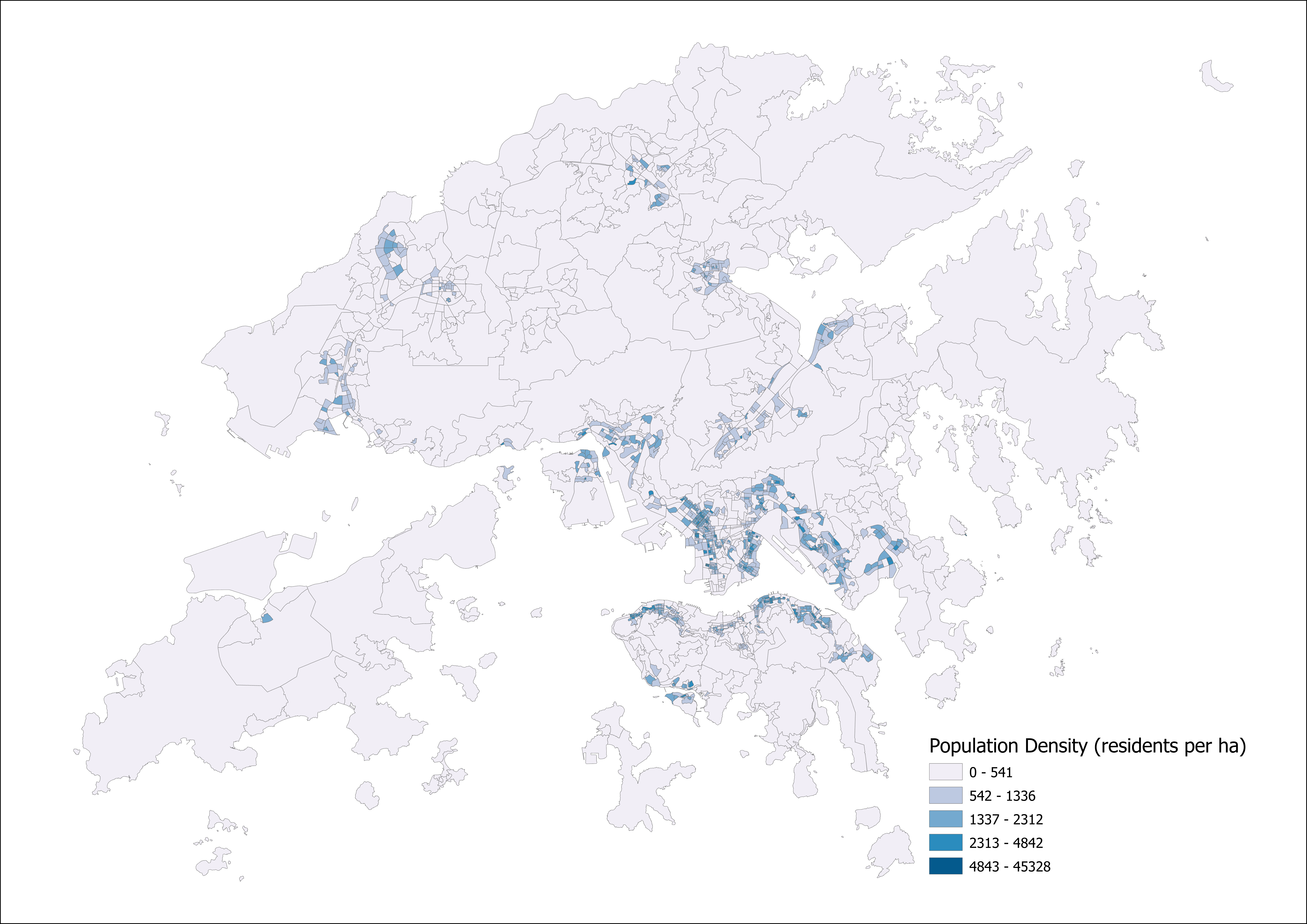
Colour Disproportionality
Put the long story short, the problem is about colour disproportionality in comparison with the population. Our brains are lazy. When we see colours, we will immediately evaluate the total weight/number of each category according to the total area of that colour appeared on the map.
One goal of mapping (and other types of data visualisation) is to represent and draw the results in a way that reflects the true proportions of each category. If we just colour the area without concerning the distribution of workers, the data will be inaccurately presented.
Mapping the US election results is always a common debate caused by this dilemma. We have tiny counties in the metropolitan areas with millions of residents squeezing inside. At the same time, we have large counties in the middle west with only a few families living in it. If we just colour the counties by the majority of the votes, the map would look like Republicans swipe across the country. The actual scenario is, as we know, a rather tie-fight between Democrats and Republicans.

On our map
Remember my old transport mode map? The colour represents the major transport mode. However, it certainly fails to present the true proportions of the original data. The grey colour (i.e. people using taking transport other than MTR/Bus/Minibus/On-foot) appeared as frequent as the red and blue. In reality, the percentage of workers using other commuting types is much lower than the proportion of grey colour appeared on the map.
The colour/population disproportionality gives a wrong impression that “people taking other types of transport to work is as dominant as MTR and bus”.

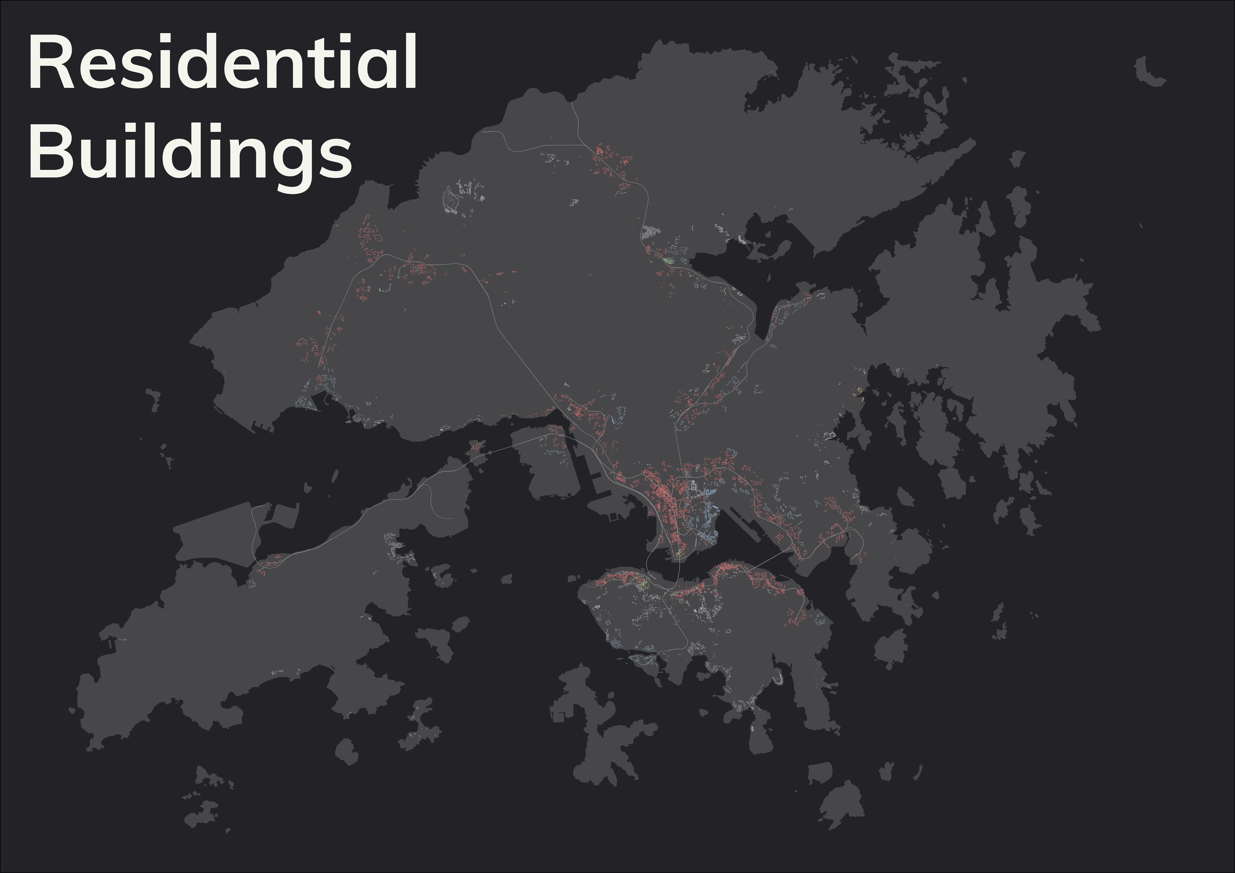
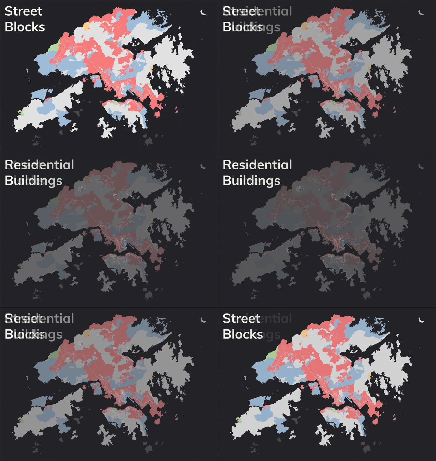
Could we make the map less misleading? Maybe… still showing the land, yet just the land which people are living in? Instead of colouring the whole street block, I fill in the colours only where there are residential buildings. By that, non-residential areas are kicked out from the sight and viewers can now concentrate in the area with people actually living inside.

You could see the light grey colour immediately get knocks out from the map. Lantau Island and Sai Kung instantly disappear, while the core urban area and new towns are still filled with pigments. To be honest, who cares the commuters in the other category when we are just looking into the competition between MTR and bus?
Yet… Is it needed?
The uninhabited areas are now excluded from the map by pinpointing the residential towers. But… Is it really a better way to present the census data?
What the census map outplays
You could probably argue that the vast majority of readers already knew where the countryside is and it is just superfluous to remove them. As a nerd having my life dedicated into maps and cities, I would say it’s common sense to know the geography of cities, and probably yell to the public “How come you little s#%! have no idea what Hong Kong looks like”.
Besides, showing only the buildings even makes the map header to read, as the colours are now packed to the tidy footprints of the towers. Say, could you answer which transport mode is the major one in Sham Tseng? With the census boundary map, you can promptly spot it out. If you are using the building one, you need a closer look.
What the building map outplays
But then, most people have a much more versatile and meaningful life that they will not have time to think about all these minor stuff and end up unintentionally got misled by my map. (They won’t even look into my map, of course.) Meanwhile, you could still argue the census unit one gives a wrong impression (first impression, at least) to readers on the percentage of workers travel with not-so-common types of transport.
My thought? I believe the majority of readers are local Hongkongers, so going with census boundary map does not hurt. Of course, I would say presenting both maps would be the best.
Hiatus
Maps, just like any other types of data visualisations tools, are always impossible to represent all truths. Part of the truths has to be sacrificed to deliver the most important message. The crucial thing for map makers is to understand what truths are dropped from the map and how the ambiguities could be minimised.
Of course, showing both maps is the best way to eliminate ambiguities.
NOTE: Showing only the buildings still cannot accurately presenting the travel behaviour. Think about why. (Hint: the colour only shows the MAJOR transport mode in the buildings. Does that mean within each building there is only one single mode of transport used?)
References
- I am inspired by Dr. Alasdair Rae’s blog to write this article
- Some blogs on mapping election results
- If you are interested in data visualisation with maps, please read How to Lie with Maps (3rd Edition) by Mark Monmonier