April 21, 2021
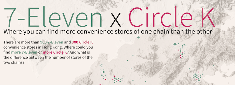
7-Eleven vs. Circle K map: How to make
Some nerdy map-making notes and explanations
972 words | 4-min read |
This place serves as a place to store some nerdy map-making notes for my 7-Eleven x Circle K mapping project (view the article in Medium, with both Cantonese and English version available). This note supplements my thoughts during the following steps in the map-making process:
- Data collection and analysis
- binning data
- Choosing cartography and data visualisation technique
- colour choice
- adding hillshade
- choosing symbology
- Typesetting and TOSSLAD
Data, raw and binned
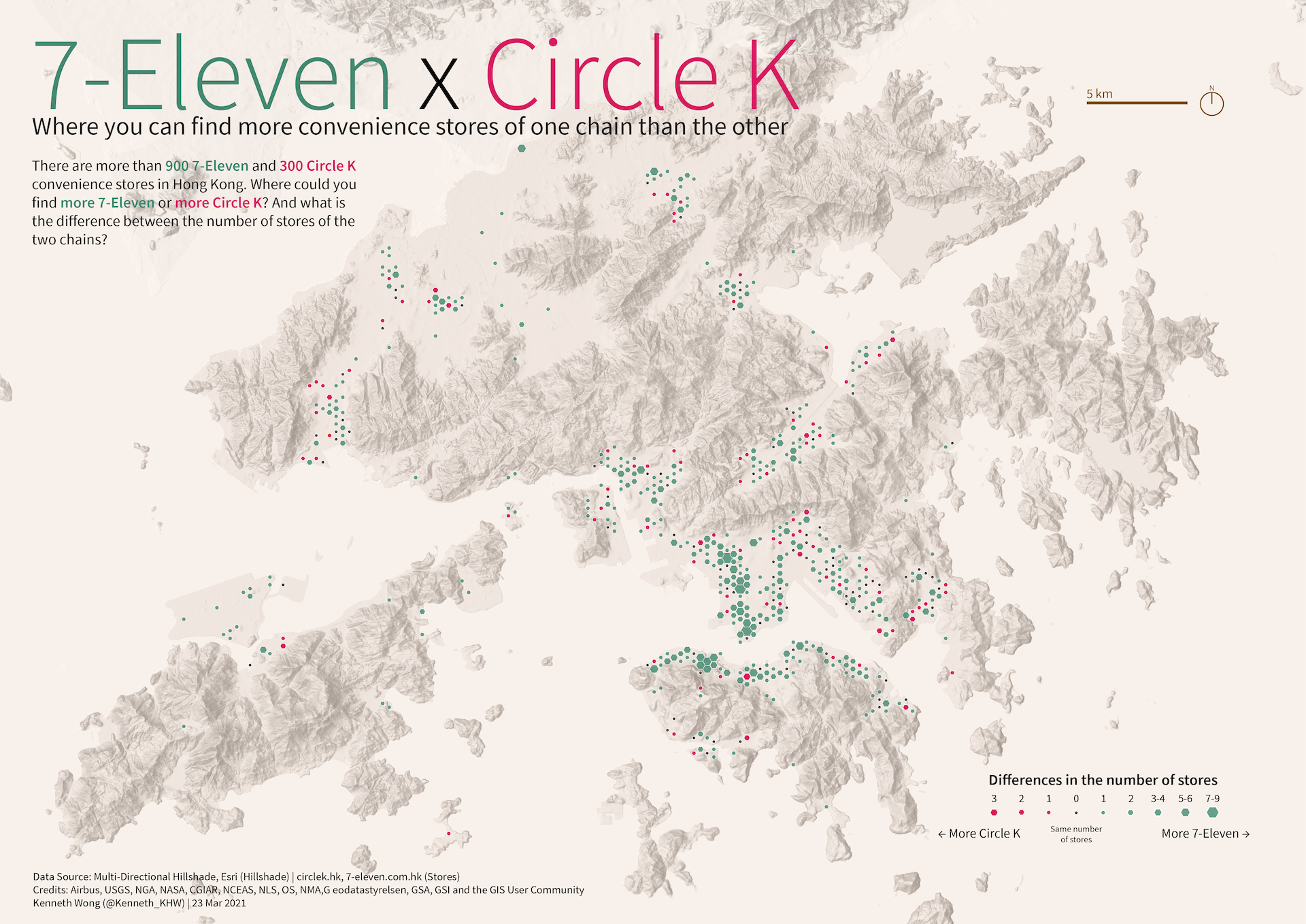
The basis of this map is the dataset of the store locations. As mentioned in the article, I did some data scraping from their website with rvest. The screenshot below is how the raw data of 7-11 stores looks like in ArcGIS Pro.
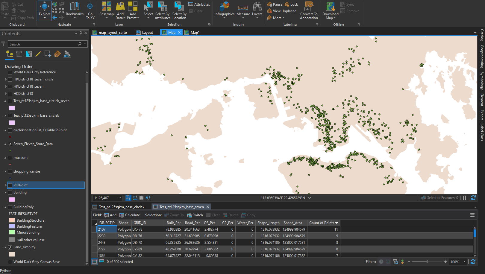
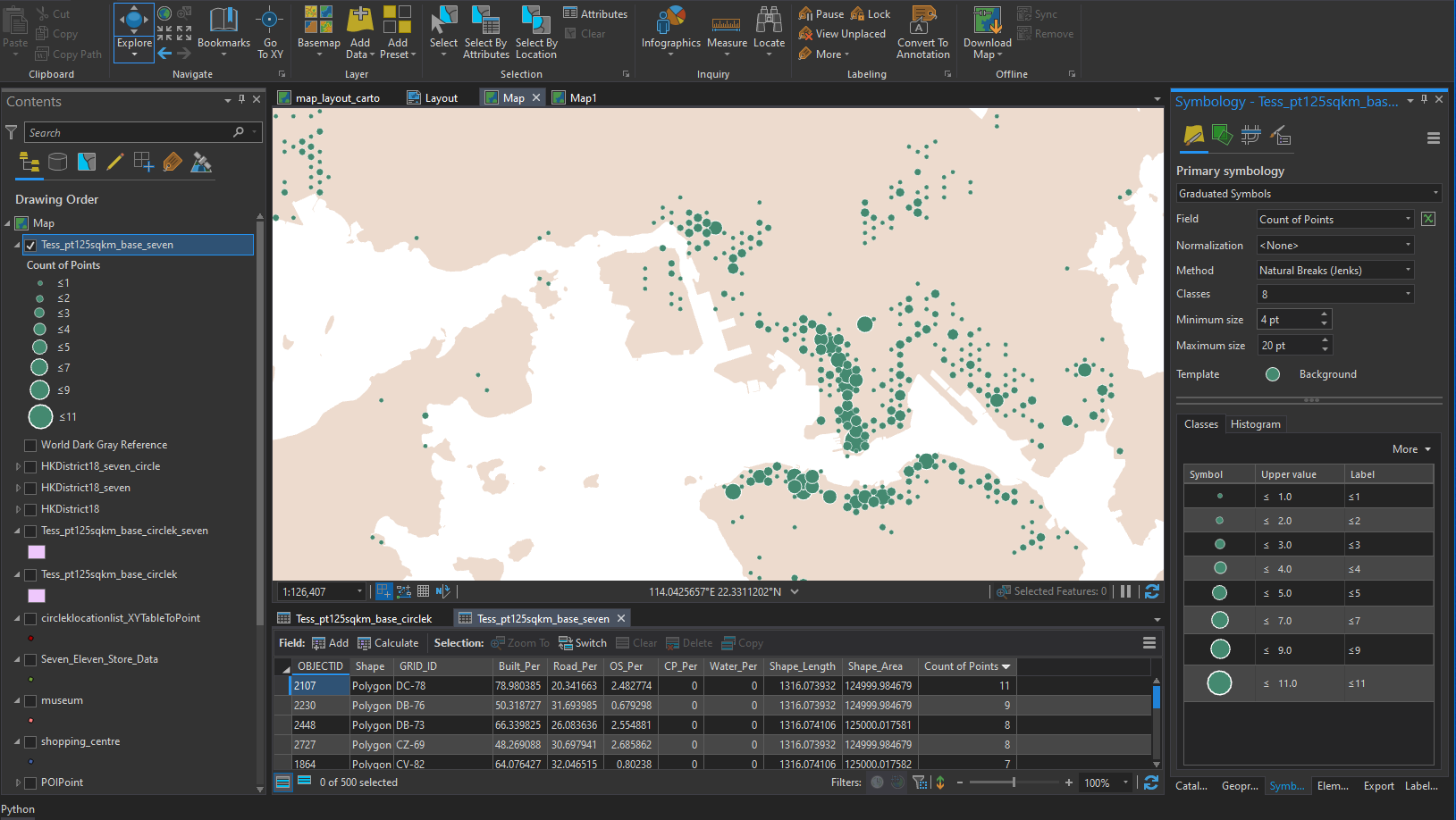
I then used the hexagonal bin created in my Gridify Hong Kong project and binned the number of stores of each chain. I changed the symbology of the bin layar with graudated symbol.
Good to go.
Colour Choice
It always need extra cautions when dealing with red-green colour palette. Usually, a red-green colour palette is considered bad in the data visualisation and cartography field, as colour-blinded usually cannot distinguish between red and green.
I followed the guideline from davidmathlogic to use magenta instead of pure red.
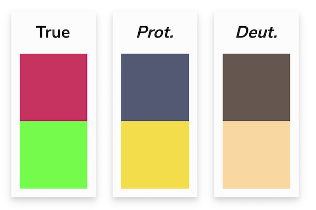
One small trick: Illustrator has a function to check whether your colour scheme is colourblind friendly. Click View -> Proof Colors and your document will be in “colourblind” mode. There are also advanced settings in the Proof Setup bar for further customisation (e.g. which type of colour blindness should be simulated).
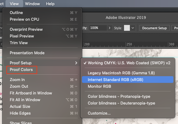
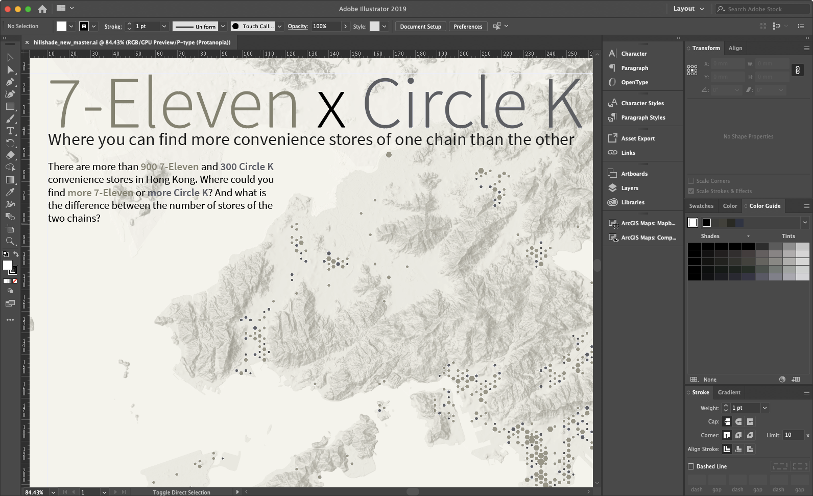
Following is the view of the poster in colourblind mode.
Hillshade
The location and geographical context of the map helps readers get the relative position. The common way to give the relative position is to use lakes and oceans, as well as other landmarks.
After mapping Hong Kong again and again, I started to realise the importance of adding hillshade to the map - in a hilly environment of Hong Kong, it is important to tell the readers where the uninhabited areas are.
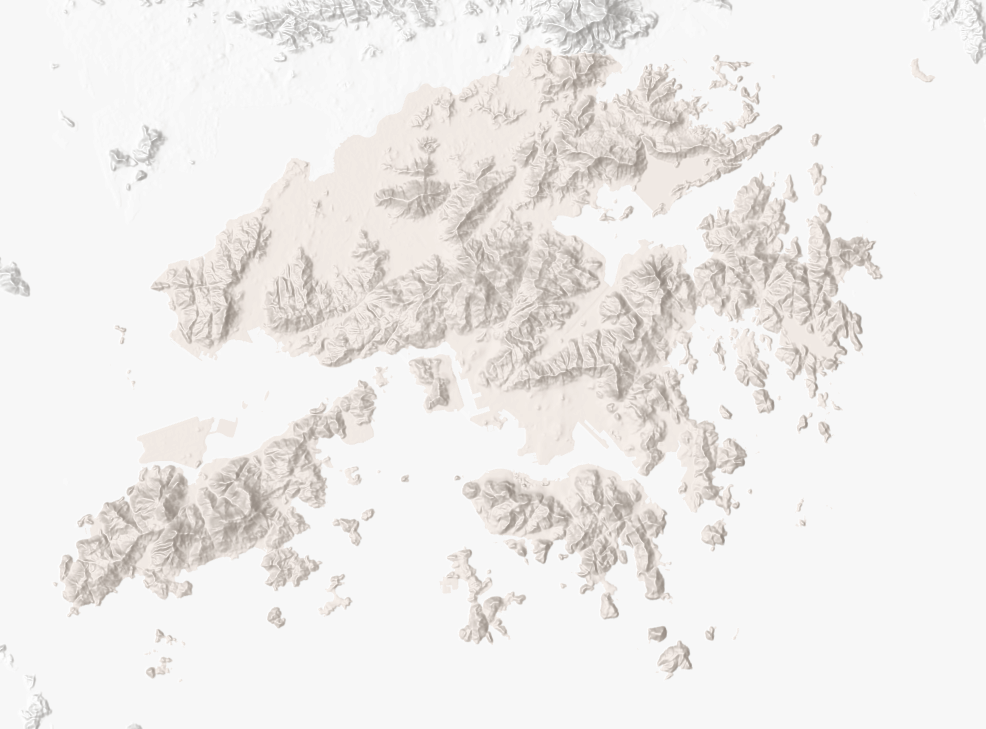
The hillshade I used is the Multi-Directional Hillshade from esri, available in ArcGIS Online. You could find additional details about this hillshade from esri’s blog (https://blogs.esri.com/esri/arcgis/2014/07/14/introducing-esris-next-generation-hillshade/)
The peaks act as importances source for readers to get an “relative location” of a place. I would say the hillshade of Lion Rock Hill clarifies the relative position of the piece of land between Kowloon Peninsula and Shatin. Probably peaks fall into the Landmark category in The Image of the City.
Symbology
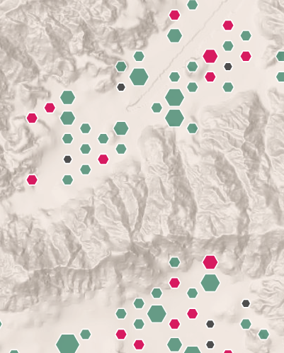
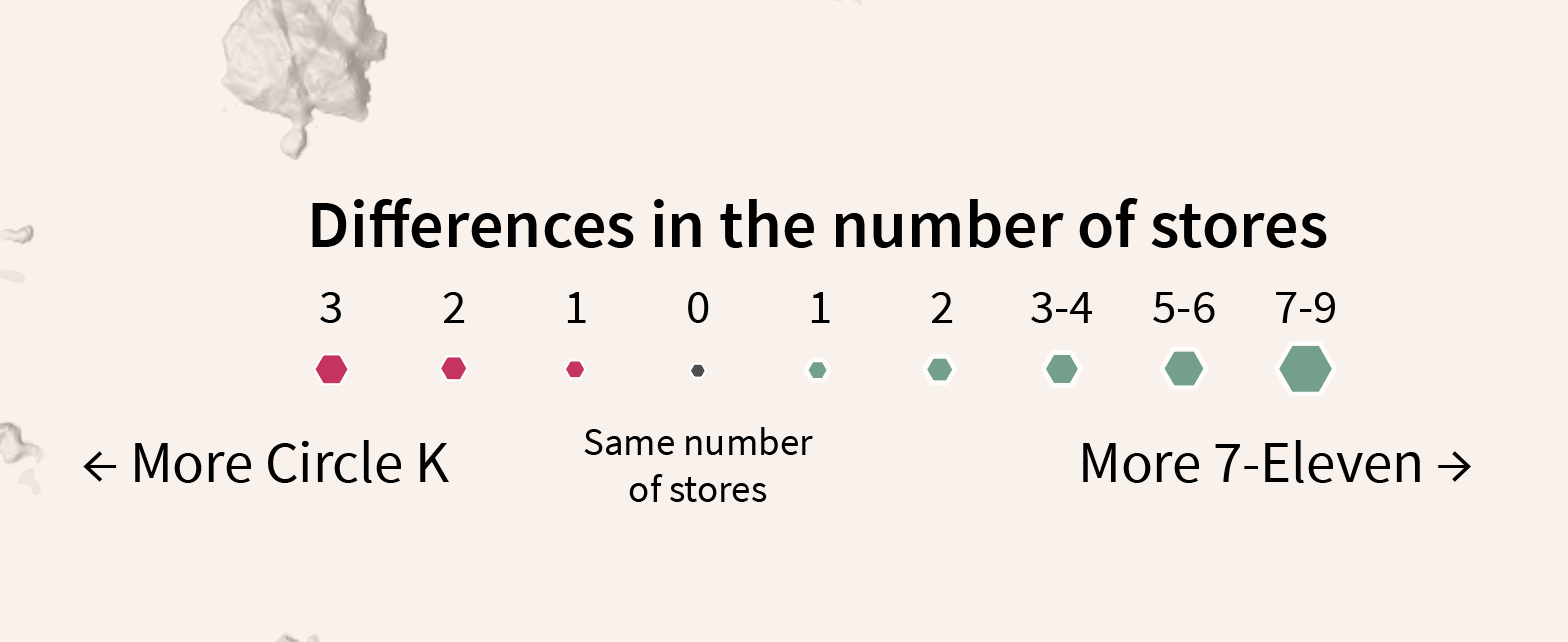
The two aesthetics (aka elements of visualising the data) I used in addition to the location (location count as horizontal and vertical element of the data) are 1. size and 2. colour.
The hexgons are just simple graduated symbol. Larger the differences between the number of the two chains, larger the hexagons. I hope this will be an intuitive symbology.
But a larger hexagon could mean there are more Circle K or there are more 7-Eleven! So I fill the hexagon with magenta/green colour to show the area is either having more Circle K, or more 7-Eleven.
I sort of struggled to choose between graduated symbol (i.e. hexagon size grouped) or proportional symbols (i.e. hexagon size absolutely proportional to the differences). After I tested with proportional symbols, I found balancing the size between the largest hexagon (i.e. the grid where there are much more 7-11 than OK) and the smallest (i.e. same number of stores) one is hard. The differences between the total area of the smallest and largest hexagon has to be 9 times.
I wish to control the symbol sizes between 20 px and 40 px for visibility. Using proportional symbols, when I set the minimum grid size to be 10 px, the largest grid will be too large (90 px). However, when I set the maximum grid size to be optimal (around 45 px), the smallest grid will become too small (5 px). And that’s why I switched to use graduated symbol afterwards.
TOSSLAD
Title, Origin, Scale, Source, Legend, Author, Date
TOSSLAD makes the map works. Fundamentally, they are necessary to make my maps as “communicative tools”, but not just map arts.
Legend
The legend are created in Illustrator, as I usually find it is more convenient to adjust the details and align the shapes in Illustrator in the layout view of ArcGIS Pro. ArcGIS Pro is convenient for me to decide the master layout and the relative size of the text. Still, for the details and some post-editing, Illustrator is the best tool for me.
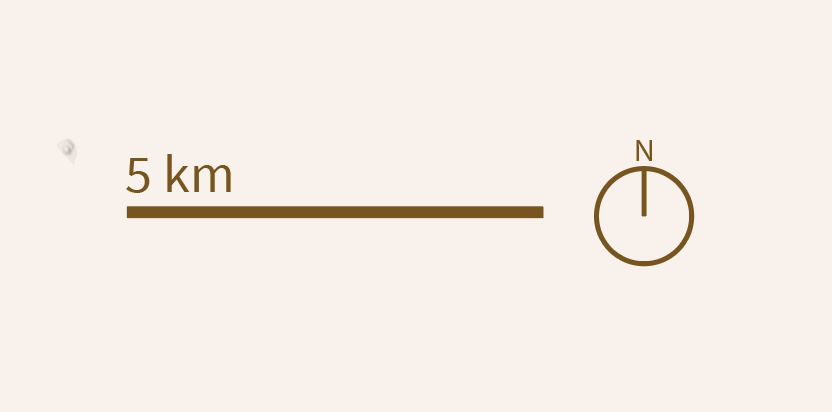
Scale, Origin
Scale bar and point north (i.e. origin) are also my old materials. I would say these two elements are for reference to help readers to get a “relative spatial sense” of how large one hexagonal grid is. Therefore, instead of a survey map with a long scale with tons of divisions and subdivisions, I prefer using simple single division rectangle as scale in thematic maps.
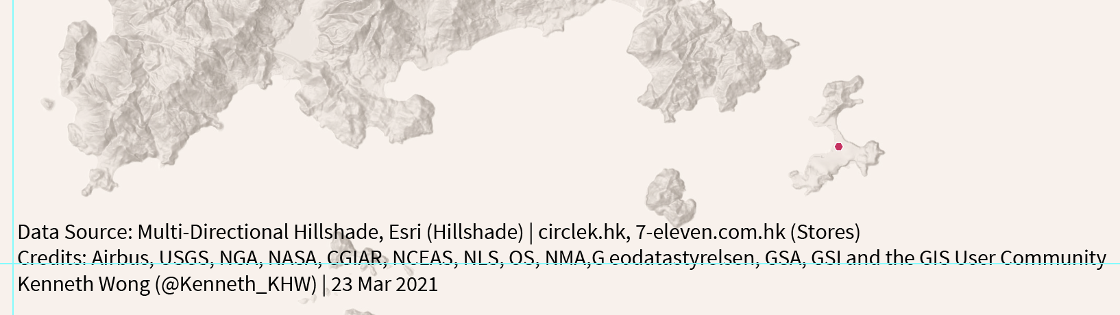
Source, Author, Date
I usually add text about Source, Author and Date on the bottom left corner. Just my convention.
Title
The title has to be on the top. Sometimes I may center it, while sometimes pad to the left. Depends on my mood.
Hiatus
So these are the techniques I used. And here we have the final map. Do you have any comments or even thoughts to improve the map? Let me know! I am more than happy to hear them.
Further Reading
- Coloring for Colorblindness by David Nichols
- ArcGIS Pro: The many ways to symbolize by size by Heather Smith
- A gentle introduction to choose between proportional symbol and graduated symbol
- Introducing Esri’s Next Generation Hillshade by Rajinder Nagi
- Background and use cases of the Multi-Directional Hillshade
- A Good Map Is Worth a Thousand Words. A Bad One—a Single Expletive
- Brief introduction of the TOSSLAD rule