June 11, 2021
R Markdown tricks for generating HTML reports
Formatting tables, Interactive map viewer, etc.
1488 words | 7-min read |
TL;DR
Rmarkdown (and markdown) are crazily useful to generate documents. I am always surprised many functions that I believe required manual edits the actually available as functions in knitr.
The details and flexibility of extending your Rmd is fully listed in the R Markdown Cookbook. Here is a list of selected packages and functions I find extremely useful (for my routine works, at least).
This list may be continuously updating, as I always learn new things about R. Though, I may not have time to write many paragraphs.
- Automatically update the last edited/updated date
- Add id tag and further style images
- Style tables with kable and kableExtra
- Interactively present spatial data with mapview
Last updated: 3 Aug 2021
Automatically update the last edited/updated date
Scenario
The rmarkdown document is continuously updating that there will exist various verison of the report. To differentiate between them, it is needed to show the last updated date on the top of the document.
Solution
This one-liner from Stack Overflow does the trick.
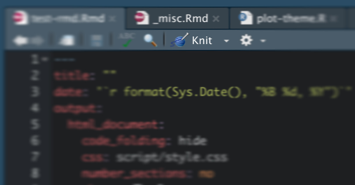
---
date: '`r format(Sys.time(), "%d %B, %Y")`'
---
Explanation
knitr evaluates the r expressions (both inline and block) to create a markdown before passing it to pandoc to convert the markdown to HTML report. Therefore, it is possible to write r expressions inside the YAML header. The inline expression above calls R to get the current time (Sys.time())when the document is “knitted”, and then format the date (format(Sys.time(), "%d %B, %Y")) to human readable format.
A full table of POSIXct formats (i.e. the magical "%d %B, %Y" argument above) is also summarised in Chapter 4 of R Markdown Cookbook.
SIDENOTE: even though I am in line with xkcd that ISO 8601 is the best way to indicate date, not all viewers agree on this. To avoid ambiguity between the date number and the month number, I usually format the month using its full name. I don’t want to involve in the war of arguing whether 11-10-2018 means 11th October 2018 or 10th November 2018.
Add id tag and further style images
Scenario
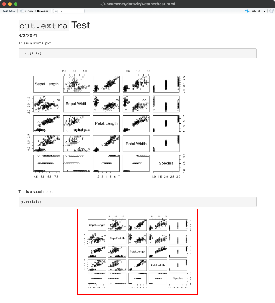
One of the plots is special and important. I would like to emphasise it by adding some additional CSS properties, say 1. align the plot to center and 2. add a red outline.
Solution
- Add an
out.extrachunk option and specify the id of the generated plot.
```{r, out.extra='id="special-plot"'}
plot(iris)
```
- Create an additional file with the name style.css. Go nuts with CSS to add thousands of properties by using the
#(id selector) from CSS. The CSS below aligns the plot to center and add a red outline to it.
#special-plot {
  display: block;
  margin-left: auto;
  margin-right: auto;
  width: 50%;
  outline-style: solid;
  outline-color: red;
}
- Include the custom CSS to the rmarkdown file to apply the aforementioned custom CSS.
output:
  html_document:
    css: "style.css"
Explanation
out.extra insert your text arguments inside the <img /> tag in HTML output (see the documentation). It is possible to insert any attributes into the tag like class and id . Thus, the CSS could identify that generated plot needs to have some special treatment.
In the screenshot below, both plots are generated with the plot(iris) command. By adding out.extra='id="special-plot"' chunk option and additional css, you could see how the layout of the plot has changed.
What if I don’t want to create additional css file? It is also possible not to create a style.css file by directly writing the style properties into the out.extra option. Of course, this makes the chunk option line hard to read when there are dozen of properties to be added.
```{r, out.extra = 'style="display: block;margin-left: auto;margin-right: auto;width: 50%;outline-style: solid;outline-color: red;"'}
plot(iris)
```
Style tables with kable and kableExtra
R-markdown Cookbook has a whole chapter dedicated to format the tables in Rmd. While basic tables could be produced with the kable() function. I usually add a few tweaks to enhance the layout of the table using the functions available in the kableExtra package. The differentiation between these two already explained in the kableExtra sub-chapter of R-markdown Cookbook.
The kableExtra package (Zhu 2021) is designed to extend the basic functionality of tables produced using
knitr::kable()(see Section 10.1). Sinceknitr::kable()is simple by design (please feel free to read this as “Yihui is lazy”), it definitely has a lot of missing features that are commonly seen in other packages, and kableExtra has filled the gap perfectly. The most amazing thing about kableExtra is that most of its table features work for both HTML and PDF formats (e.g., making striped tables like the one in Figure 10.1).
kableExtra::kable_styling() and kableExtra::column_spec() are the two functions I use heavily. And the code block below the options I usually use.
table %>%
  knitr::kable(
    caption = "TABLE NAME",
    digits = 2,
    format.args = list(big.mark = ","),
    col.names = c("A", "B", "C", "D")
    ) %>%
  kable_styling(bootstrap_options = c("striped", "hover"), full_width = F) %>%
  column_spec(1, bold = T, border_right = T)
It would be easier to show how the table is created by adding functions one by one like below.
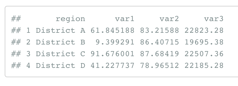
Print the table directly
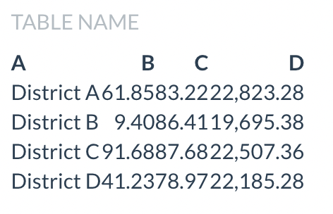
table
A basic output as how R console prints a dataframe. You will just bring more questions to the viewers when you present a “table” like this.
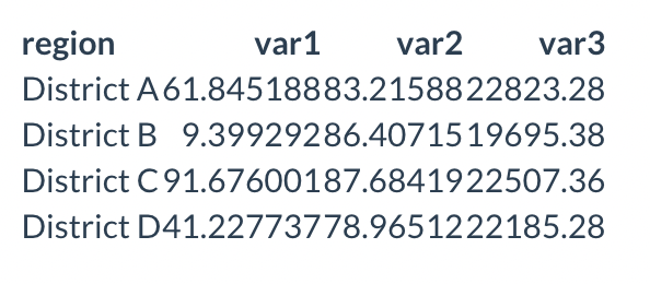
kable() without arguments
table %>%
  knitr::kable()
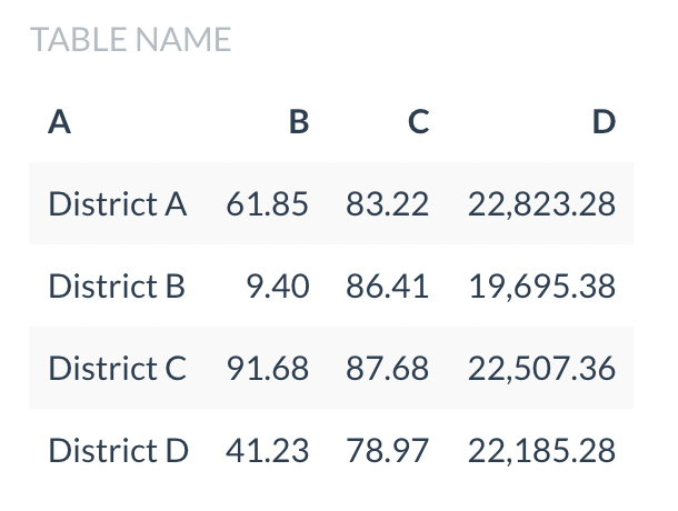
kable() with arguments
table %>%
  knitr::kable(
    caption = "TABLE NAME",
    digits = 2,
    format.args = list(big.mark = ","),
    col.names = c("A", "B", "C", "D")
    )
captionallows you to add title of the tabledigits = 2rounds the numbers to 2 decimal placesformat.args = list(big.mark = ",")adds thousand separator to the numberscol.namesis a column vector to change the name shown in the first row
Extra table styling with kable_styling()
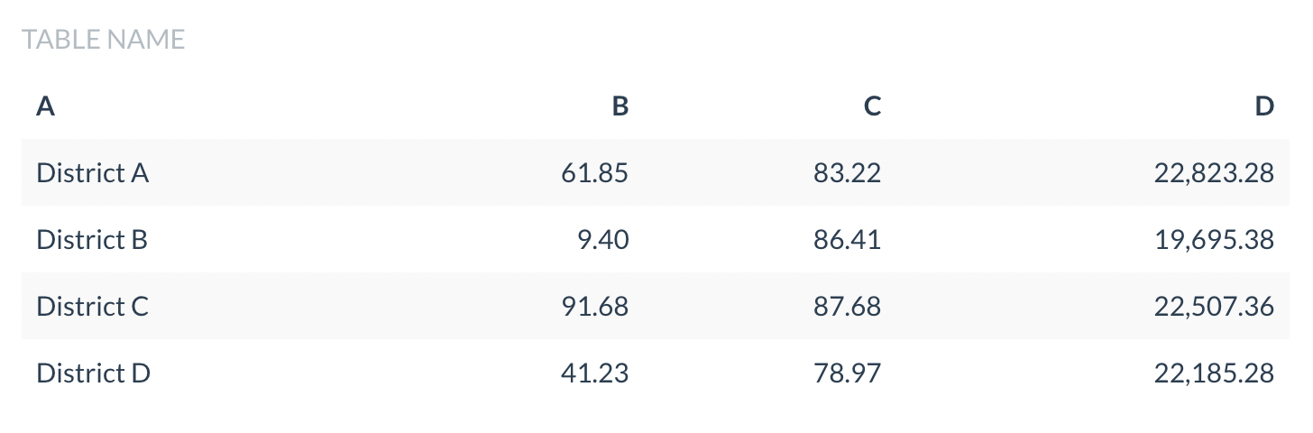
table %>%
  knitr::kable(
    caption = "TABLE NAME",
    digits = 2,
    format.args = list(big.mark = ","),
    col.names = c("A", "B", "C", "D")
    ) %>%
  kable_styling(bootstrap_options = c("striped", "hover"), full_width = F)
bootstrap_options argument adds extra styling for bootstrap table options stated in the Bootstrap Tables Tutorial. I use the following two options:
"striped"(adds zebra-stripes to a table), personally a tidy contrast between rows feels easier to read"hover"(adds a hover effect (grey background color) on table rows), allowing viewers to easily know which row they are reading by just nudging the mouse
full_width controls whether the width of table should spread across the whole webpage.
Below is the same table with 100% width (full_width = T). I found wide tables weird, so no, thank you.
Specify look of specific column
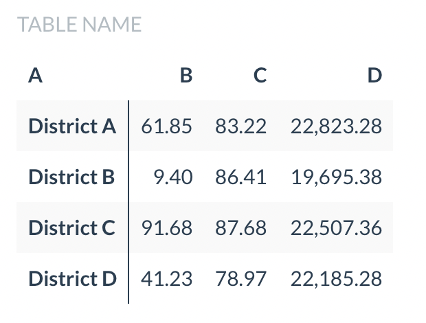
table %>%
  knitr::kable(
    caption = "TABLE NAME",
    digits = 2,
    format.args = list(big.mark = ","),
    col.names = c("A", "B", "C", "D")
    ) %>%
  kable_styling(bootstrap_options = c("striped", "hover"), full_width = F) %>%
  column_spec(1, bold = T, border_right = T)
The first columns usually refers to the name of each unit of analysis. Differentiating between this column and other “data columns” looks better (again, my personal opinion). column_spec allows tweaking specific columns by providing the column number and the layout specifications. As explicit as the argument names, bold changes the text in that column to bold font, while border_right adds a border (a thicker, darker line) to the right of that column.
And here you have the final formatted table.
Interactively present spatial data with mapview
In terms of doing spatial data, I believe GUI is important. While the leaflet package is the basis of interactive mapping, it is somehow for creating end products - interactive maps for final presentations. In my case, I usually want to embed an interactive map in the knitted document (99% of the cases are HTML) for readers to explore the spatial data and check their attributes after clicking on the features. Therefore, I usually use mapview instead of leaflet in knitting the analysis result documents.
mapview provides functions to very quickly and conveniently create interactive visualisations of spatial data. It’s main goal is to fill the gap of quick (not presentation grade) interactive plotting to examine and visually investigate both aspects of spatial data, the geometries and their attributes.
From README of mapview package
Below is a screenshot of using the mapview function to explore a dataset of traffic collisions in Hong Kong, available in the hkdataset package (Yep, this is an advertisement of a package my team is developing).
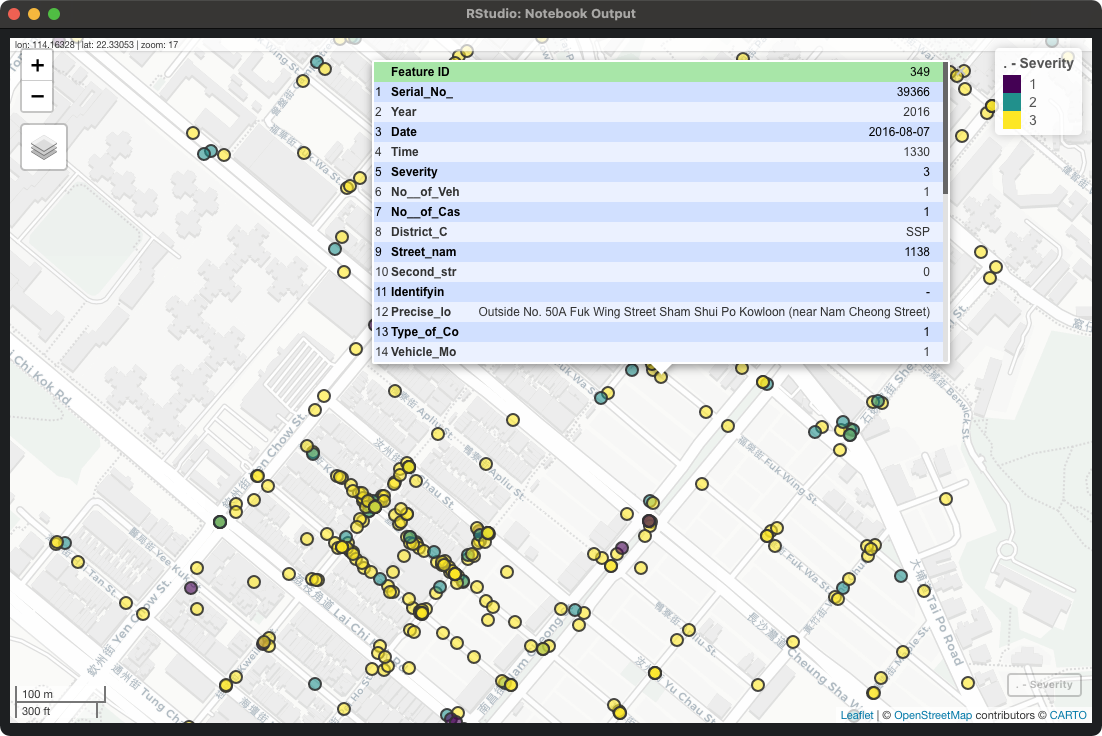
mapview is one of my favourite packages because of its resemblance of common GUI GIS software. You can interactively drag and zoom around the map frame. You can adjust the symbology quickly. And you can click on the spatial data on the map frame to check the attributes. This makes me feel comfortable when I have to check the results of spatial analysis. I just call the mapview function to interactively view the result spatial data, click on the polygons to check whether attributes are computed correctly.
Further Readings
R Markdown Cookbook - Update the date automatically
https://bookdown.org/yihui/rmarkdown-cookbook/update-date.html
YAML current date in rmarkdown
https://stackoverflow.com/questions/23449319/yaml-current-date-in-rmarkdown