September 02, 2020
How to make a stale map in ArcGIS Pro
808 words | 4-min read |
TL;DR
This article guides you on how to create an old-fashioned, pen-n-ink style map from scratch, quickly.
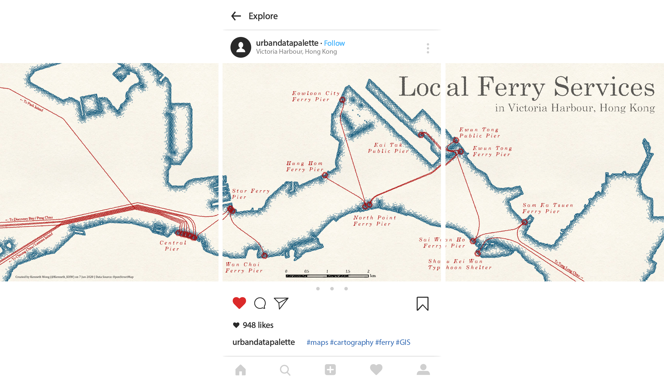
A short time ago, I worked on a static map presenting the ferry routes in Hong Kong for practising my GIS skills and for fun. Much like the other static maps, I need to find a place to document how this map is made for my reference. And, if possible, this could be used as some basic tutorials for students trying to make some “aesthetic” style map in ArcGIS.
This map is indeed just some tasks on data collection and symbology adjusting. In terms of manual or technical work, this should not take so much time. Majority of the time spent is actually about how to make the map “aesthetically pleasant”.
Part I: Data Preparation
Ferry Routes and Ferry Piers
I get the location of ferry piers and the ferry routes from OpenStreetMap data, using Overpass Turbo.
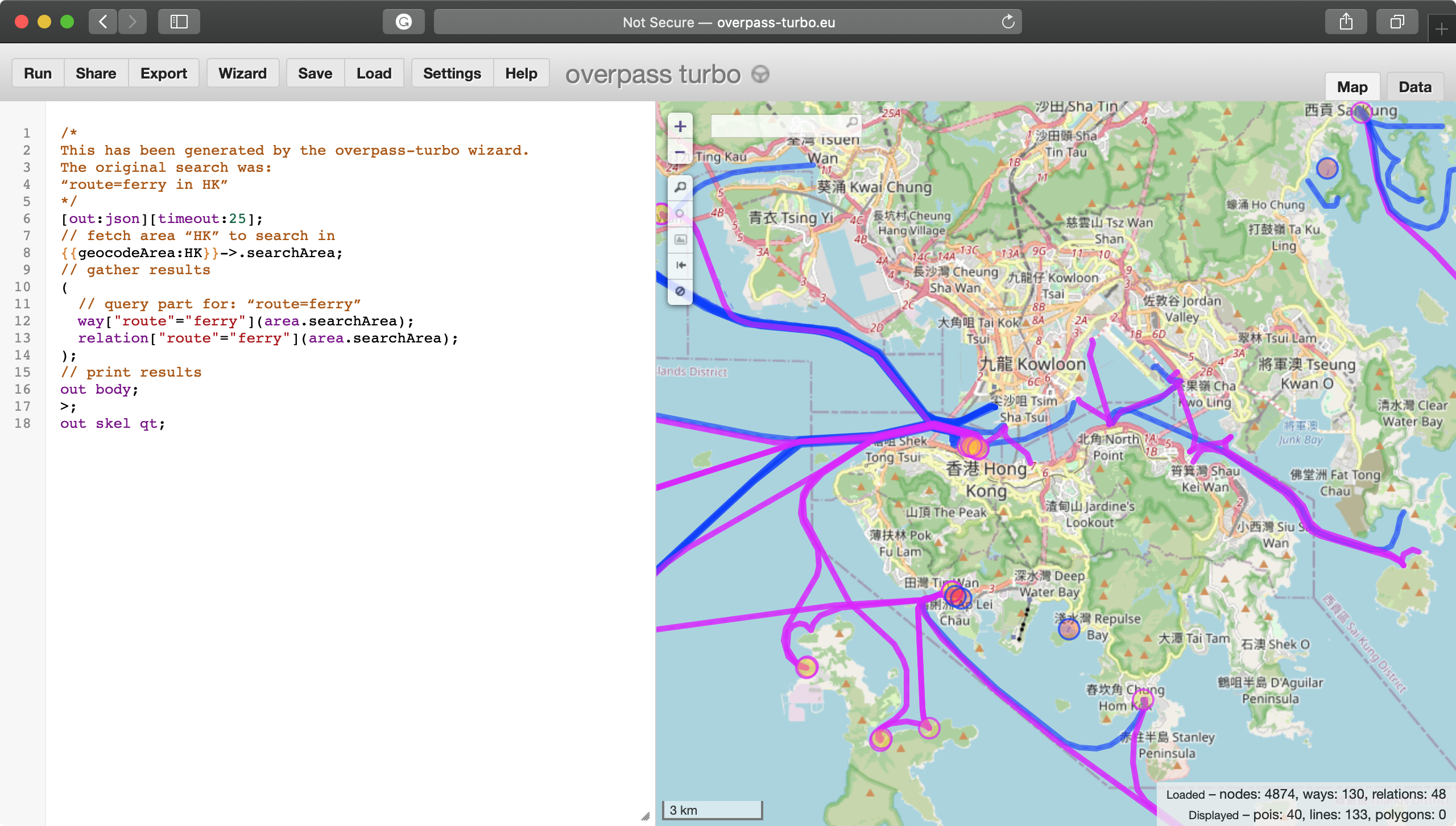
Following is the code used to grab the ferry routes. This simply equals to type in route=ferry in HK in the query wizard provided by Overpass Turbo.
[out:json][timeout:25];
// fetch area “HK” to search in
{{geocodeArea:HK}}->.searchArea;
// gather results
(
  // query part for: “route=ferry”
  way["route"="ferry"](area.searchArea);
  relation["route"="ferry"](area.searchArea);
);
// print results
out body;

out skel qt;
Waterfront
The waterfront I used, is from the basemap provided by the Lands Department. You could download the digital map open data from here:
https://data.gov.hk/en-data/dataset/hk-landsd-openmap-b50k-topographic-map-of-hong-kong
Still, you could still use OpenStreetMap data when you want to have a try!
Part II: ArcGIS Pro
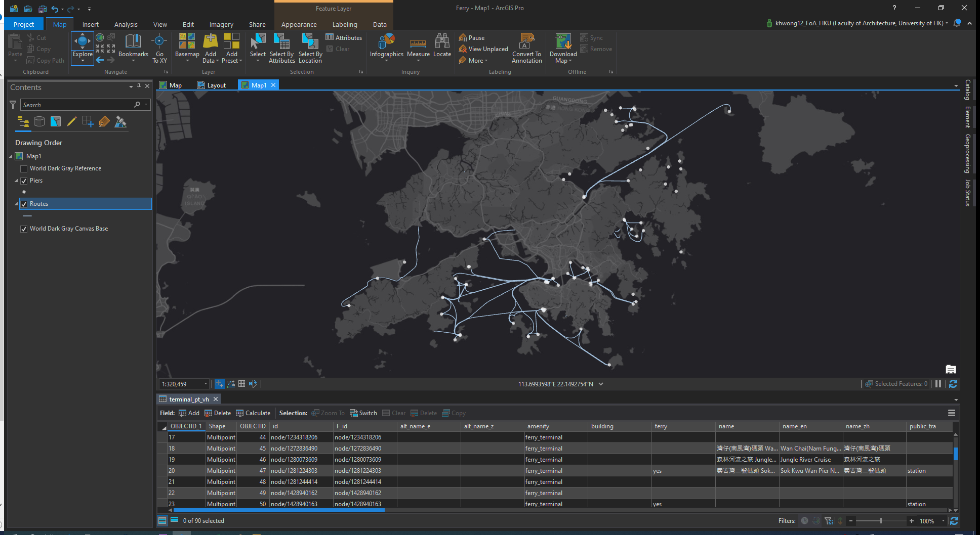
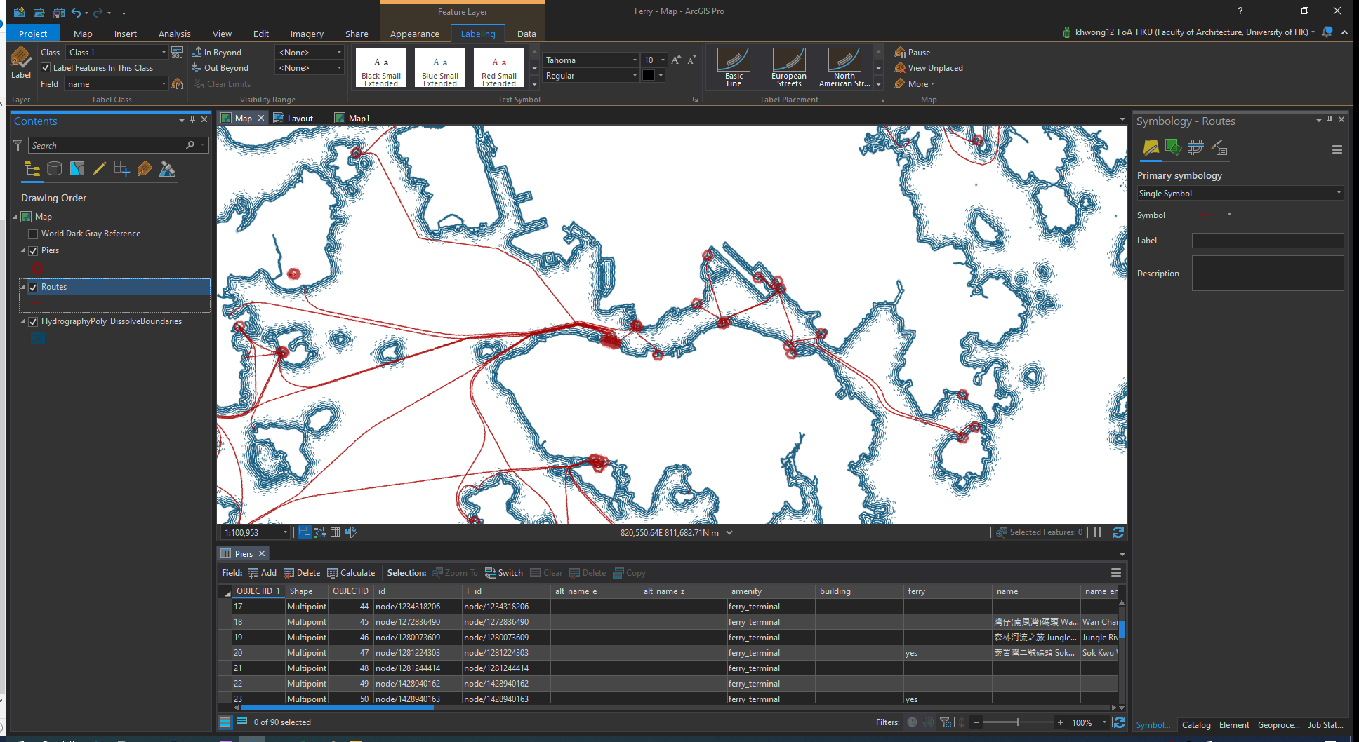
Let’s throw all the routes and pier data into ArcGIS Pro. (Use JSON To Features function to import those geojsons downloaded from Overpass Turbo!) As I am only interested in the ferry routes in the Victoria Harbour, I created a subset of data by manually select and click on the lines and points.
Symbology
This is the fun part! We have to do some experiments on the canvas of ArcGIS Pro and keep adjusting the symbology until we are satisfied with it.
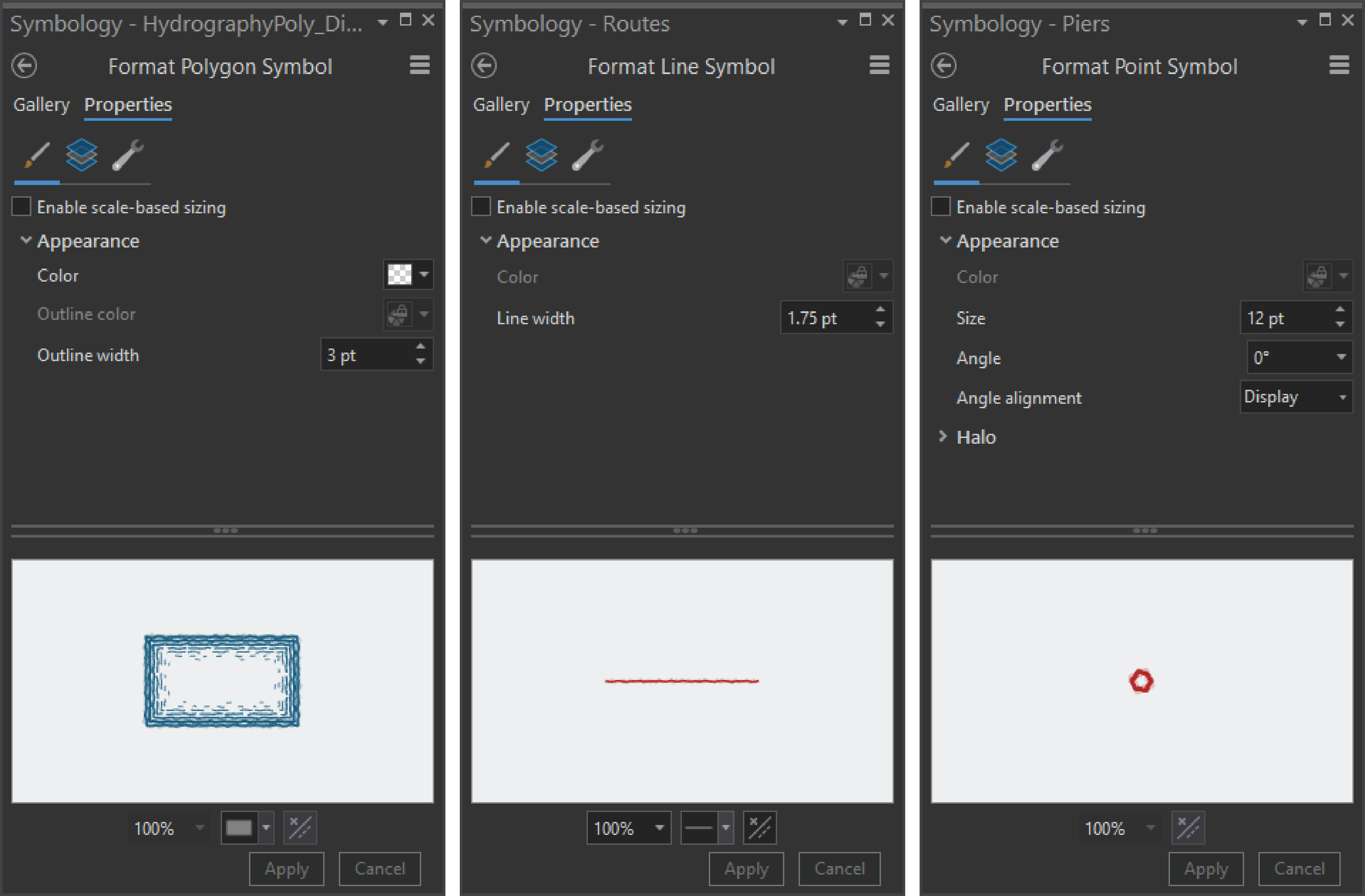
I brought the Pen and Ink symbology created by John Nelson again. After all, there’s nothing better than some pre-made symbology that could allow you making good-looking maps without some tough jobs.
Below is the symbology I used. You could try fine-tuning the size and use other symbols which you found better.
- Waterfront: Ripple, 3pt
- Routes: Fine Red Line, 1.75pt
- Piers: Ring Red, 12pt
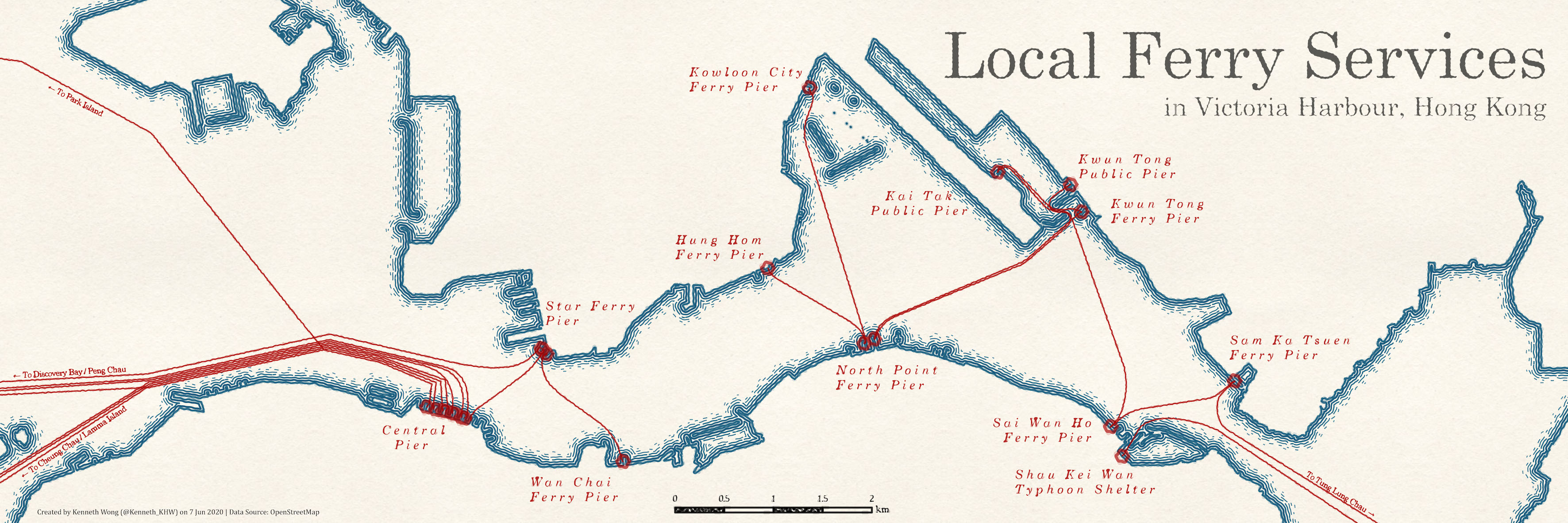
This is how the map goes after changing the symbologies. Already some nostalgic vibes going around the screen I guess?
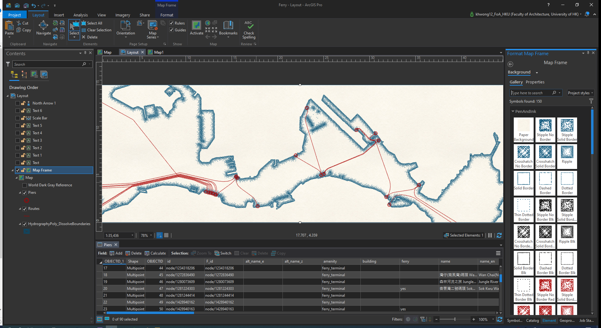
Layout
Time to export the map. Create a 45cm x 15cm layout and add a map frame of the current map to the layout. Why having a strange layout like this? Well, I was experimenting with some Instagram layouts at that time, thus tried to make a 3:1 aspect ratio.
After that, change the background of the map frame from transparent to a paper background, which is also available in the Pen and Ink style. This is how it goes…
What left is only adding labels and some post-editing.
Part III: Post-edit in Photoshop and Illustrator
I adjusted the labels and added a few words in PS and AI for some post-editing. This is just a personal preference, you could do all these typesetting matters in Layout view of ArcGIS Pro. I am too just picky here that want to do some manual editing to enhance the overall layout.
To facilitate the progress and save the export time, I exported TWO maps. The first one includes the basemap and data (i.e. those need NOT post-edits), while the second one only have labels (i.e. those need post-edits).
Export the labels and text layers as pdf (not jpg/png!). Import the pdf file to Illustrator and this is the initial mess we left in ArcGIS Pro.
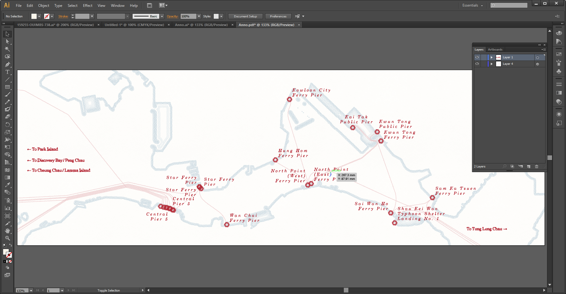
Manually move and resize the labels to desired locations instead of the default location ArcGIS rendered. Besides, remove redundant labels. Say, the Star Ferry Pier appeared several times (as there are multiple piers in Tsim Sha Tsui Star Ferry Pier, of course). I removed those duplicated and moved the label to the inland area. Here’s how it looks like after dragging the labels…
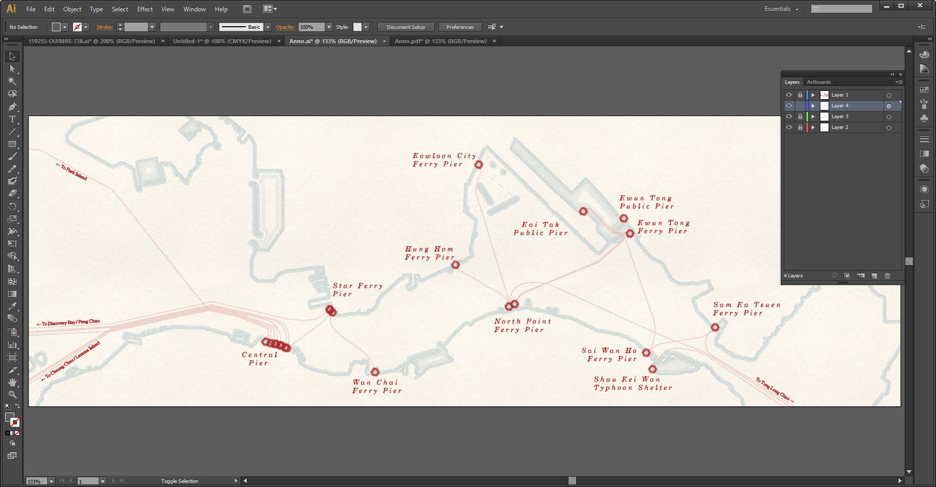
When it’s all good, copy the labels and extra texts and paste as a vector smart object layer in Photoshop.
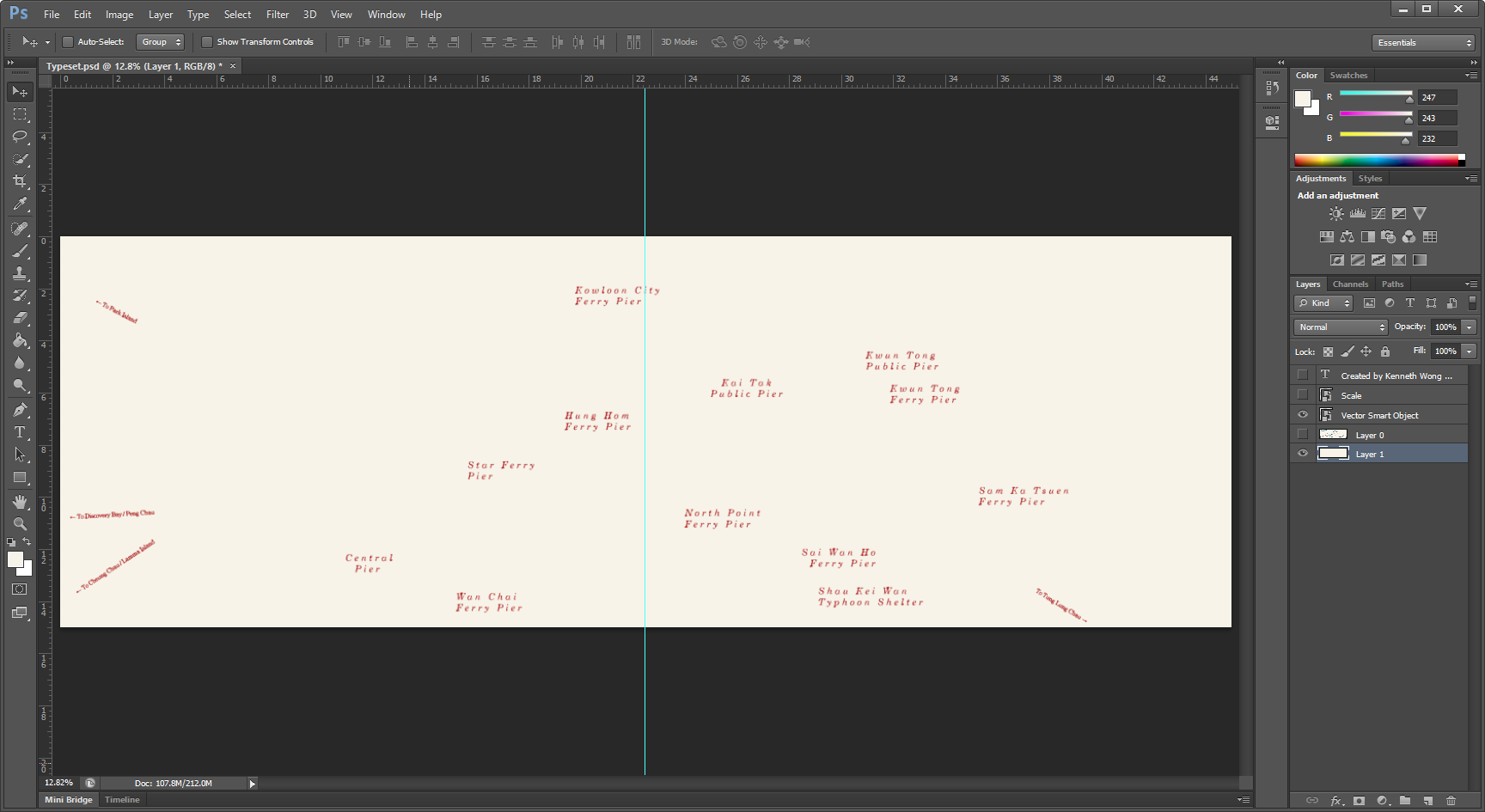
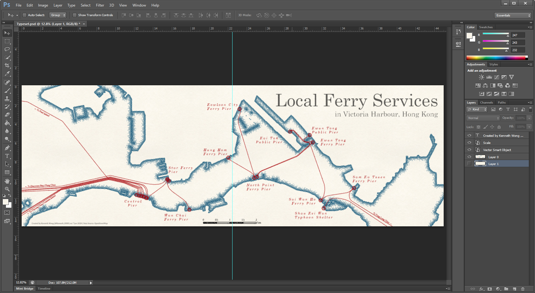
Add the other map we exported earlier to Photoshop and Eureka!
NOTE: Normally, you should be able to post-edit solely in AI (i.e. just export the one single map including all layers, then edit only the label layer). However, my AI automatically removes the ripple lines when reading the file (some unknown bugs maybe). Thus, I take this “two software” detour.
Hiatus
And this is how I make a not-so-historic ferry map. To be honest, the time used for taking screenshots and writing this article takes much longer than merely making the map.