March 27, 2021
Interactive visualisation of commute pattern in Hong Kong
Interactive charts and (sort-of) scrollytelling with R & Shiny
754 words | 3-min read |

Note: This blog is crossposted from my Medium page.
Originally, I believe this blog is more like a story-behind note that fits here. However, turns out it becomes an introduction and “user guide” of the app. The final paragraphs becomes a mix of guiding the readers to read the charts, while in the same time explaining the reasons behind adding those charts and the layout of the webpage.
I found rather hard to classify this blog (or should this be an article?) belongs to Behind the Scene category or Data Essay. I deem Medium as a place for publishing “data article”/“data essay”, while personal blog as some technical notes and random thoughts.
So crossposting to both pages might not be a bad idea. After all, this is my blog and I can do whether I want. In addition, no one cares about my blog, right?
TL;DR
I wrote a webpage (with interactive charts!) using Shiny and R to visualise the commute pattern dataset I used in the previous article.
Are you interested to play and mess with the commute pattern dataset of Hong Kong? Want to select your area of focus without touching the dataset? Or, you are just looking for examples of web applications developed using Shiny? This is the article for you.
This article serves as a place to introduce the webpage I created for interactively visualising the commute pattern dataset. The webpage is created using Shiny and available at the following link:
https://kenneth-12.shinyapps.io/place-of-work-od/
The background of this dataset is already explained in my previous article. And there is a short intro paragraph waiting for you on the top of the webpage to refresh your memory.
Interactive charts available
You can find three charts on the webpage. There is a short paragraph on the top of each chart to explain how to read the chart. Here, I will add some footnotes of each chart.
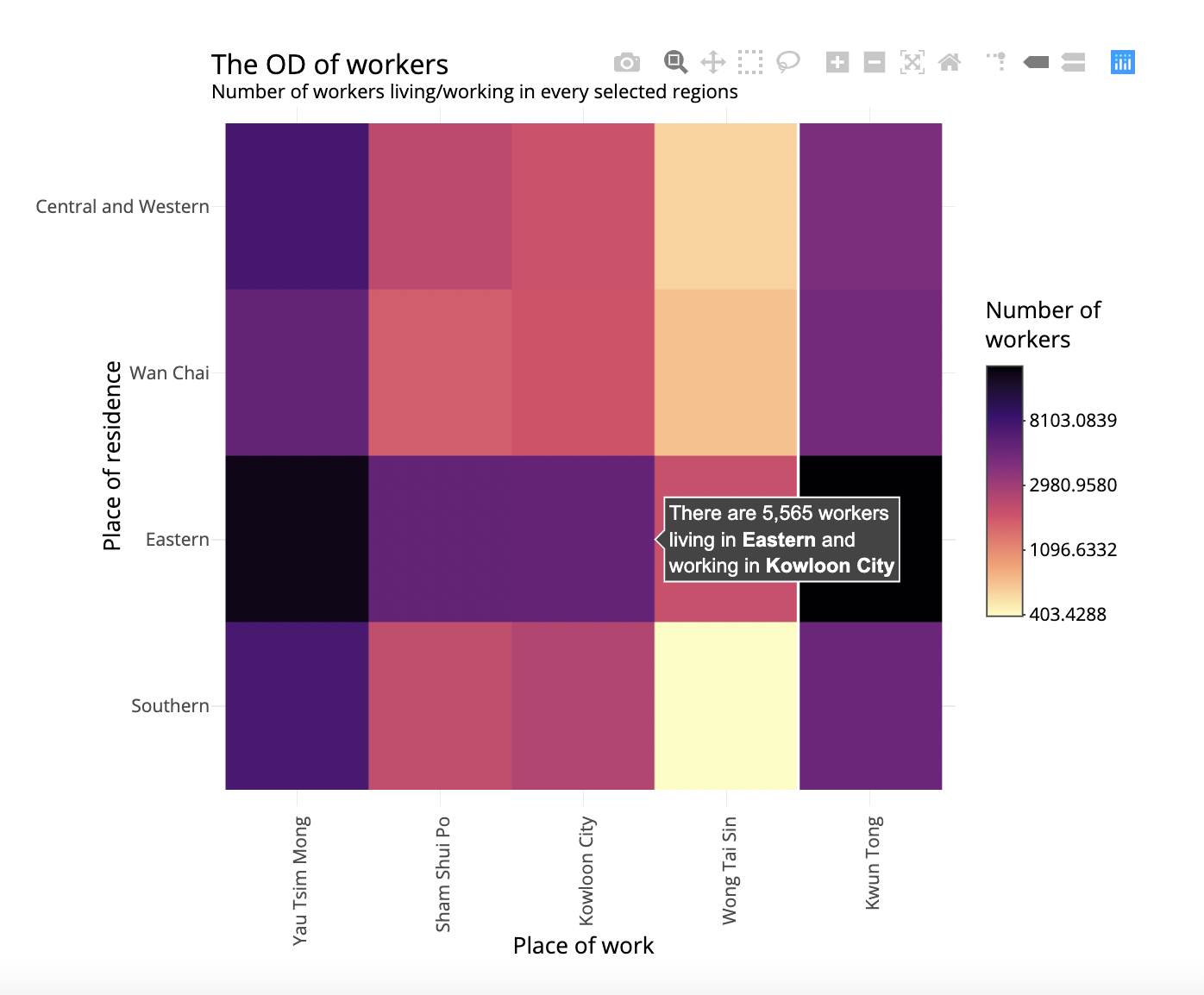
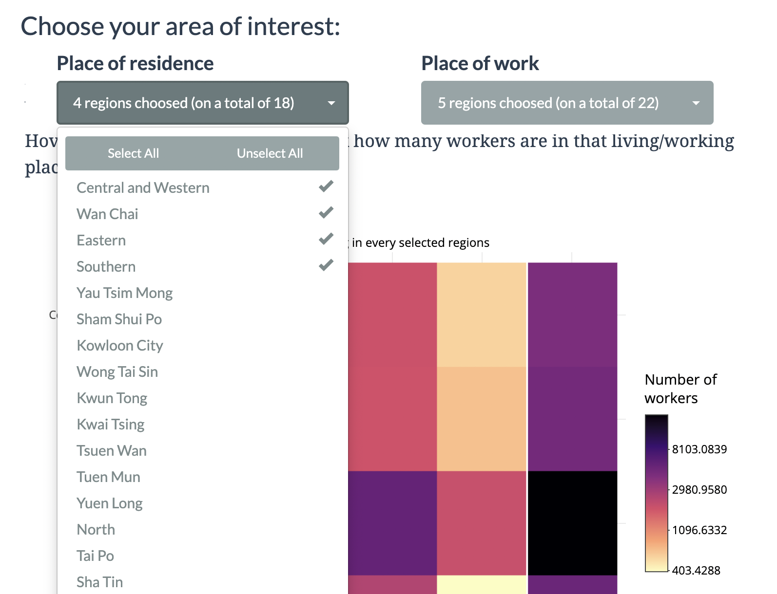
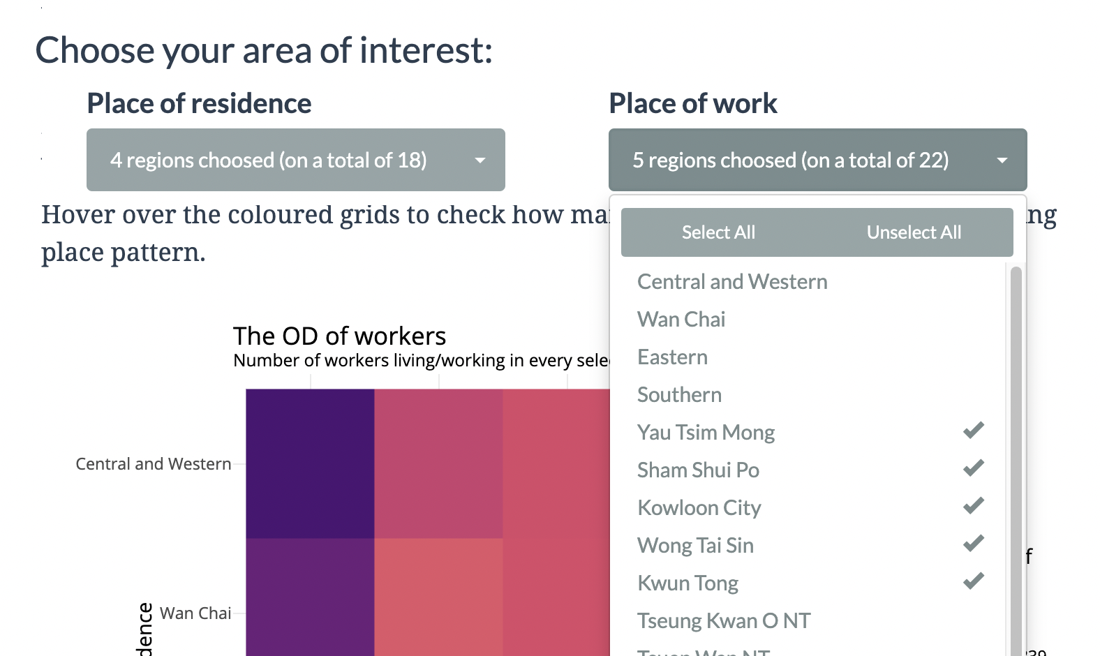
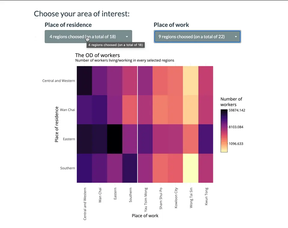
I: Interactive OD matrix heatmap
This OD matrix is created using the same visualisation ideology in the article. That is a coloured OD matrix.
You can hover on the coloured grids to check how many workers are in that living/working place pattern (which act as a small explanation on WTH the chart is going on).
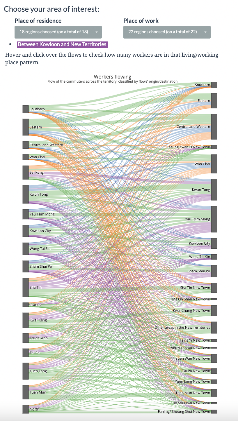
II: Interactive flow (sankey) diagram
The next chart is a sankey diagram. Same as the heatmap above, when you hover on the flows, a tooltip will appear, explaining that specific flow (i.e. how many workers are in that living/working place pattern).
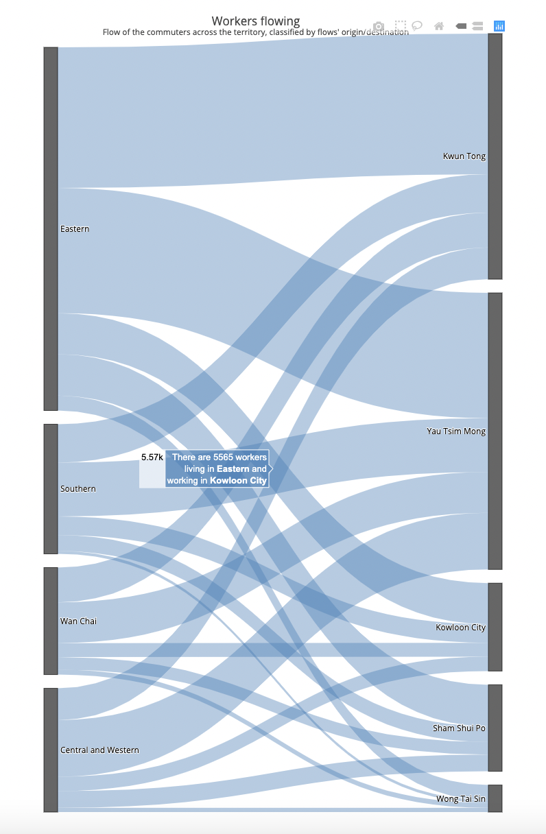
The sankey diagram worths some explanations. The dataset behind this sankey diagram is entirely the same as the one used for the heatmap. The differences are in the method of visualisation. Just like you could use a stacked bar chart or a pie chart to present the proportion of a total, the OD matrix could be visualised in many different ways.
In my opinion, heatmap is strong for:
- viewing the overall trend
- more common for readers
Sankey diagram is strong for:
- viewing how PART (or even ONE single flow) plays in the whole dataset
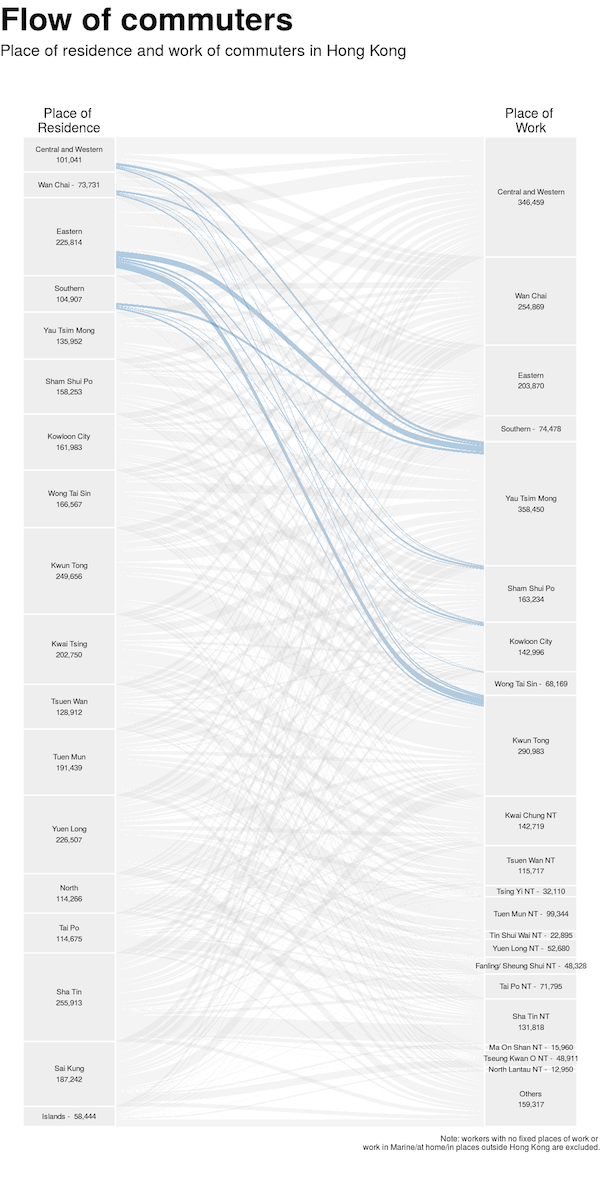
III: Sankey diagram, highlighted version
The last chart is not interactive - you cannot see the details of each flow when hovered on the flow. This is intended, as the aim of this chart is to compare the proportion of the selected living/working districts (coloured flows) to the overall trend of Hong Kong (grey flows). Sometimes, interactive charts may hinder the readers to grasp the message behind them.
Selecting your area of interest
The point where Shiny shines is allowing users’ input more than merely some hover-and-check-details actions. There is a section on the webpage for choosing your specific area of interest. The two drop-down menus let you choose the living area and working area you are interested in. The OD heatmap and flow diagrams will display only the selected living/working area pair of flows.
By default, the app selects the 4 districts in Hong Kong Island as the living area and all 5 districts in Kowloon as the working area. Therefore, the OD heatmap has 4 rows (i.e. origin) and 5 columns (i.e. destinations).
You can select living and working regions according to your interest. The charts will change immediately after you select/unselect some regions. Observe how the charts change!
You could even recreate the chart in the article by selecting all place of residence and place of work.
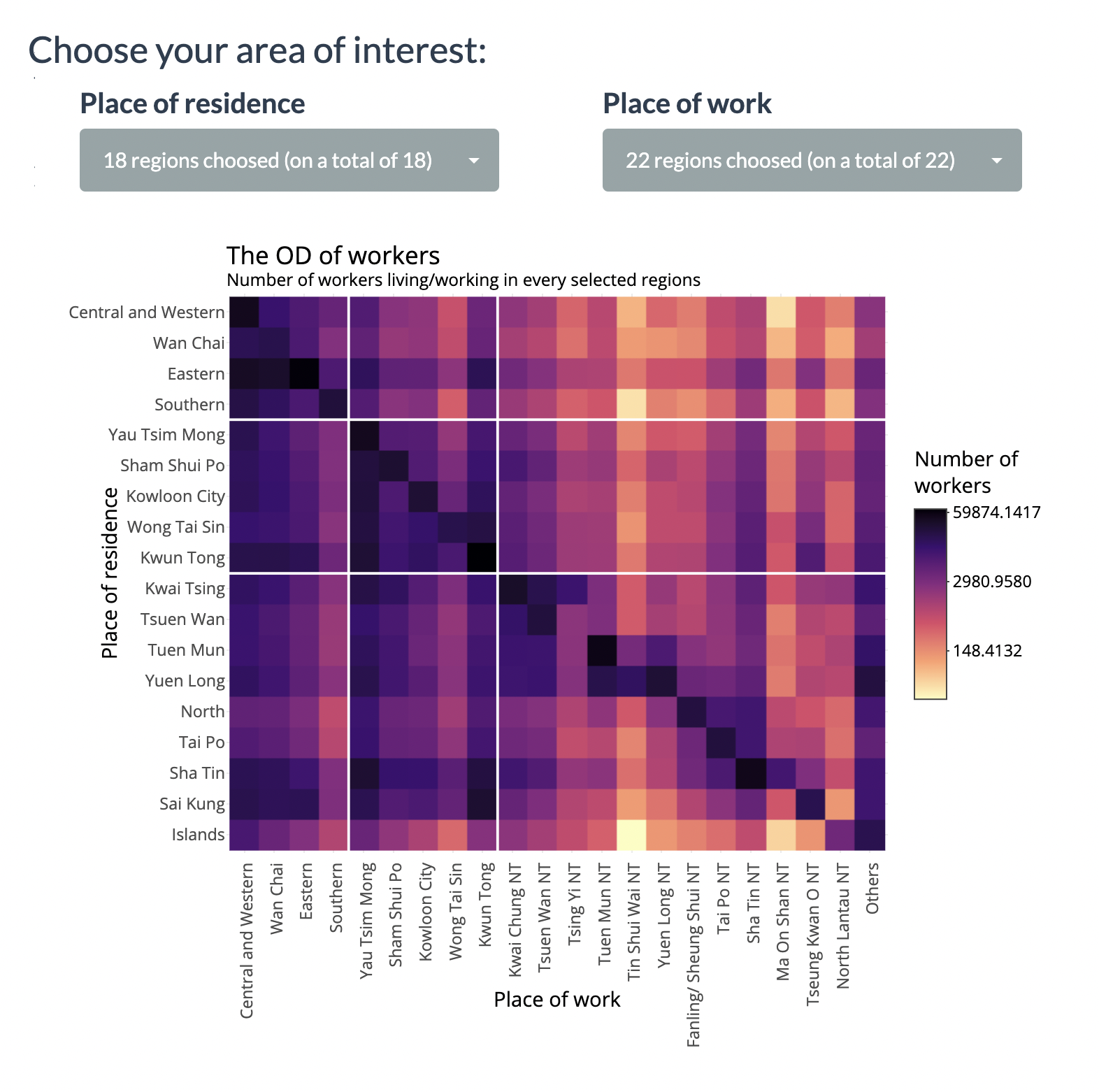
Though, under the heatmap we now have a crazy sankey diagram. That’s why you probably should not consider using sankey diagram to derive insights lying behind the dataset.